Sunday, 8 February 2015

Vintage Valentines - Rimmel 60 Seconds - 560 Odyssey

Lilac/silver pearl  


Apologies - I got caught up yesterday and didn't get time to post.

So here's my delayed Vintage Valentine.  Another Rimmel 60 Seconds from the '90's but I think we'll all agree this one is much less desirable than the previous stunner!


Odyssey is a silver/lilac pearl.  In sunlight it looks more silver, in shade more lilac.

It's pretty but also pretty brushstrokey and I can see in the third swatch, a bit bald near the cuticles, I probably should've done 3 coats.

Swatches are 2 coats, no top coat.

So not such a great colour but I do really like the bottle shape on these old Rimmels.


Thursday, 5 February 2015

Vintage Valentines - Rimmel 60 Seconds Extreme - Zeitgeist 878

Stunning plum/green duochrome


Rimmel were probably the first nail polish brand I was aware of.  Back in the 70's they marketed themselves through double page ads in women's weeklies like Woman and Woman's Own.   Spread across two pages they would showcase each shade and variant of a particular product, foundation & blusher, eye products and nail polish.  The nail polish ad consisted of a grid of close to 100 close-ups of stylised nails each painted with a different Rimmel shade, like some kind of periodic table of nail polish!

I haven't been able to find the exact ad I remember but this one is close...


My sister and I would pore over the ads, each choosing our favourites in turn - if only we'd had the money as pre-teens to buy any of them!

In the early 80's I finally had money (courtesy of a job delivering local free papers) and would excitedly head to Woolworths in Canterbury to peruse the selection in person.

Of course back then they were mostly shades of red, pink and pinky nude with the odd purple, blue or green shade to add excitement.  And I was more interested in the pearls and frosts than boring cremes, how times change!

Fast forward to the 90's and Rimmel is no longer one of a small number of players with the market sewn up, all kinds of new drugstore brands have come along, and everyone has to up their game.  So, perhaps influenced by the extreme colours and formulations of people like Urban Decay, Hard Candy and Rimmel's drugstore rivals Revlon and their Streetwear range, Rimmel put out all sorts of amazing colours under their 60 seconds and Lasting Colour ranges.

Here is one of the standout shades from that time, Zeitgeist, a fantastic name for an amazing polish.


Zeitgeist is a strong plum/green duochrome.  The plum is warm, pinkish and somewhat muted, the green is yellow toned, almost olive.

In artificial light it's plum with a hint of green but in sunlight it really comes alive.  The duochrome flip is so strong you can get both colours showing on even moderate length nails.

Swatches shown are 2 coats.

Sadly, as you can see, I have a duff bottle and all of the white overlay printing has come loose and moved around and I've had to put sticky tape over the bottle to try and preserve what's left.  After I'd taken these pictures I found another bottle of Zeitgeist in my stash, label still intact.

Application on this one was a bit odd but that may have been down to the many drops of thinner I'd had to add.  From my limited research it seems a number of the 8xx series Rimmels were standout shades, including Climax, Zenith, Mania (coming up) and Fanatic.  And what awesome names.

Tuesday, 3 February 2015

Vintage Valentines - 17 - Space Babe

Lilac/silver pearly foil  


Welcome to the second Vintage Valentine!  

This polish comes from 17,  which I don't think is a particularly 'covetable' or collectable brand.    

17 or Seventeen is a Boots exclusive brand aimed at a younger market (15-19 year olds according to the internet).  The brand itself is over 40 years old, launched in 1968.  I'm not sure how old this polish is but this version of the 17 packaging was launched in 1998.


Space Babe is an Advanced Wear One Coat Polish in a lilac/grey pearl/foil.

Application was ok, but of course it's pretty brush-strokey and I did two coats for completeness.

It's quite pretty and has a soft glow, almost like brushed steel

Sunday, 1 February 2015

Vintage Valentines - Sally Hansen New Lengths - Espresso Frost

Warm red/brown shimmer  


Myself and fellow UK nail blogger, Lina-Elvira from Pretty Perfect Beauty have cooked up a plan for February to show off some of our older polishes, hence Vintage Valentines.

We agreed anything older than 5 years was vintage in nail polish terms, but I don't think I'm planning to share anything newer than 10 years.

So over this gloomiest of months we'll be sharing the HTF, the VHTF and the damn near impossible to find....

I'm kicking off with one of my favourite vintage brands, Sally Hansen New Lengths.  Back in the 90's (I think) they used this name for a range of colour polishes with self coloured tops.

Let me say that again, the polish lids were made of the same colour plastic as the polish inside the bottle.  How wonderful and crazy is that?  They had to make different coloured lids for all the polish colours!  And on a drugstore polish no less.

At some point they must've realised the error of their ways as a few of this bottle shape New Lengths have plain black lids.

I have a small collection of just 7 of these polishes, 6 with self-coloured lids, one without.  I'm pretty sure I picked these up on my first holiday to the US back in 1996 - one has a CVS price label on for $2.85!

The bottles are 13.3ml/0.45 fl oz with a tall lid and the brush is long, flexible and narrow.

So on with the pics & swatches..


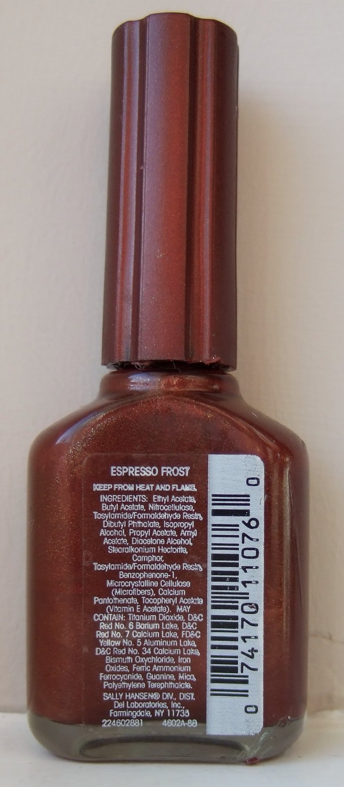
Espresso Frost is a warm reddish brown with lots of gold shimmer that really comes alive in the sunlight.

Application with this was great, the narrow brush didn't cause me any problems and the formula was good, if thin in texture.

Swatches shown are 2 coats with no top coat.

I didn't have to add any thinner to these polishes, whatever magical combination of chemicals is in these 20 year old babies keeps them liquid and ready to go!   You can see the ingredients label above, suffice to say they're not 5-free, the only nasty I couldn't spot was Toulene.

And if you want to see more of the collection Kaz from Pretty-Random has a great reference guide though she doesn't quite have all of them (yet).

And don't forget to check out Lina-Elvira's first Vintage Valentine


Tuesday, 20 January 2015

MeMeMe - Lapis

Frosty pale blue  


Oh dear, this, the last of the vintage MeMeMe's is not so much of a win.

Lapis is a metallic/frost pale blue that looks almost silver in direct sun.

Swatches are 2 coats with a lot of brush marks.  Perhaps top coat would've helped with this one?

Monday, 19 January 2015

MeMeMe - Pin Up

Vibrant bright red    


Oooh, I like this one.  And a great name too for this kind of colour.

Pin Up is a bright red with a fairly subtle gold shimmer running through that gives the red depth and glow, fabulous!

Again swatches are 2 coats with no top coat.

Sunday, 18 January 2015

MeMeMe - Goddess

Fir green shimmer


Another vintage MeMeMe, this time a mid toned fir green shimmer

Swatches are 2 coats, no topcoat.  And again it's super sparkly in sunlight.


Saturday, 17 January 2015

MeMeMe - Splish Splash

Turquoise blue shimmer  


MeMeMe is a brand sold in Superdrug in the UK.  This, and the following 3 polishes, are somewhat vintage MeMeMe.  The current polishes are in a different bottle and, more significantly, have a 'maxi-brush' giant brush that I cannot make work with my tiny nails.

Anyhow, back to the vintage bottles which have lovely normal brushes!

This is Splish Splash, a nice name for a shimmery almost metallic turquoise blue and look how it sparkles in sunlight.

Swatches shown are 2 coats, no top coat.

Stay tuned for three more vintage MeMeMe's...

Wednesday, 14 January 2015

Nails Inc - Royal Court

Bright blue creme  


Royal Court is a vintage Nails Inc bright blue creme from early 2009, maybe 2008.

Coverage and application were great, swatches are 2 coats with no top coat.

I also did a couple of comparison shots with a more recent bright blue, All Saints Road


l-r  Royal Court, All Saints Road, Royal Court, All Saints Road.

They're pretty dupey but not quite there.  All Saints Road is a little lighter and dustier than Royal Court.  But All Saints Road is much easier to get hold of on ebay.

And in case you were wondering, neither is a dupe for Nails Inc's most famous bright blue, Baker Street, which is much more intense and cobalt leaning.

Thursday, 8 January 2015

Leighton Denny - Honey Trap

Milky mushroom creme  

Ah, you know I love a taupe - or mushroom in this case.  I think mushroom is more pinky and taupe is more purple leaning - agree?

Anyhow, I spotted this and liked the look of it so then it was a case of stalking it on ebay till one popped up for a reasonable price.


To me Honey Trap is a pale, creamy mushroom/taupe creme.  Leighton's site describes it as a warm clay,  I'm not sure I would've got to this colour from that description.  They also have a bottle shot that doesn't look much like the colour either!

Application was good, LD's almost always are and as you can see it's lovely and shiny without top coat.

Swatches shown are 2 coats.

Saturday, 3 January 2015

Nails Inc - Whitcomb Street

Burgundy foil shimmer  

Belated Happy New Year everyone!

Kicking off 2015 with a gorgeous gold flecked burgundy from Nails Inc.


Bottle closeup

Whitcomb Street is a gorgeous deep burgundy jellyish creme with loads of gold and pink flakie goodness.  It's stunning in sunlight and nearly as awesome out of it.

Application, of course, was great.  Swatches shown are 3 coats due to those jelly tendencies, with no top coat.

There are hardly any swatches of this online so I'm wondering if it was a QVC special or similar, most people seemed to get it as part of a Nails Inc lucky dip....  Can't remember how I came by it but I love it!